Adelie Health

Helping patients self-manage multiple medications at home safely and independently

Bite-sized summary

Adelie health is a mobile app that promotes safety for patients taking several medicines by leveraging AR technology to overlay medication data on a patient’s physical space.

Project type

Medication
concept app

Project stack

Figma, Notion, Whimsical

My role

Product designer

Timeline

One month

Problem

1 out of 2 patients will have a medication error

  • Prescriptions change frequently and people are confusing their medications.
  • 49% people discharged from hospitals will take their medicine incorrectly.
  • 125,000 people will die each year from poor medication management.

Audience

The elderly population is growing

  • 67% of adults aged 65 years and up take at least 5 medicines daily.
  • Even though many are physically / cognitively able, having multiple medicines complicates this daily task.
  • With the growing elderly population, safe medication management is a need that grows more dire each year.

the objectives

  • Design an end-to-end mobile app that will help patients self-manage their medications safely
  • Use augmented reality technology as a feature
  • Create a solution that differentiates from the market

the challenges

  • Healthcare is a highly regulated & confidential space
  • AR adoption might be challenging for target audience
  • Real AR prototype would be ideal to test for usability
  • No AR design experience before project
  • One month timeframe
Introducing. Introducing. Introducing. Introducing. Introducing. Introducing.

Adelie Health

Easily add medications

Instead of making patients manually input complex medication information, OCR technology parses the data from pill bottles or prescription lists and organizes it for them.

Safely take
medications

Patients can point their cameras towards their pill bottles to see helpful information imposed on their environment. Through AR, they can quickly find out when or why they’re taking a medicine.

Customize medication instructions

Healthcare has no “one size fits all” solution so Adelie encourages customization. Patients can easily glance at their pill bottles and find personalized instructions as it pertains to their own health.

Understand unfamiliar medications

Instead of having to recall the doctor’s explanation of the medication, patients can be reminded of why this medication is important in their overall care plan through interactive elements and informational text.

Final Solution

The protoype takes users on a simplified flow that offloads physical and mental interaction burden away from patients.
See prototype on Figma

Business Value

Reducing economic impact on healthcare

If the life-saving potential is not convincing enough, it’s estimated that the healthcare system incurs $300 billion annually in avoidable costs due to emergencies and hospital readmission from poor medication management.

Integrating Adelie Health within a hospital system can reduce non-reimbursable admissions and protect hospitals from operating at a loss.

LONG TERM VISION

Optimizing for product market fit

Future forward, Adelie also has multiple potential entry points for users by integrating within healthcare or pharmaceutical systems through which Adelie Health is set up on a patient’s device as part of their medication instructions.

Adelie also has potential partnerships with pharmacies, telemedicine apps like GoodRx, or integrating within AR-friendly platforms like Snapchat or Instagram.

A goal-directed process. A goal-directed process. A goal-directed process.

Project Breakdown

I know you’re busy. So here’s the nutshell of my process with steps I took to get there - some of which are highlighted in more detail in the case study below:
  • 1. Project scoping

    a. High-level scoping of industry problem

    b. Stakeholder meeting

    c. Project scoping

    d. Project timeline

  • 2. Research

    a. Research plan

    b. Market research

    c. Competitive analysis

    d. Contextual review guide

    e. Contextual observations

  • 3. Data synthesis

    a. Research findings

    b. Empathy map

    c. User journey

    d. User persona

  • 4. Problem definition

    a. POV statement

    b. HMW questions

  • 5. Ideating and strategy

    a. Aligning business and usergoals

    b. Long term vision

    c. Divergent thinking

    d. Convergent thinking

    e. Accessibility

    f. Feature roadmap

    g. Information architecture

  • 6. Interaction design

    a. Task flow

    b. User flow

    c. Product requirements

    d. Low fidelity sketches

  • 7. Usability testing

    a. Mid fidelity wireframes

    b. Prototyping

    c. Usability testing plan

    d. Usability test with users

    e. Affinity mapping

    f. Prioritization of revisions

    g. Updates from usability

  • 8. User interface

    a. Mood board

    b. Style tile

    c. Design system

    d. High fidelity prototype

❤️ Why I’m passionate about this project

Working in healthcare, I’ve seen patients confuse their medicines, squinting to see the bottle’s small letters, trying to recall instructions. I also witnessed a family member double their insulin dose and literally almost die before my eyes.

The responsibility of managing medicines ultimately falls on the patients when they’re home. Left to their own interpretation of medical information, errors can easily happen. ☠️ I believe there’s a way to save these patients....

Research

After gaining a high-level understanding of this particular industry problem, I scoped the project and organized my timeline for this first sprint. Then I created a plan of attack (research plan) and kicked off the process with secondary research to delve deeper into the problem space.

See market research on Notion

COMPETITIVE ANALYSIS

Current solutions focus on tasks but not safety

Products already exist to help patients adhere to their medication schedules but current solutions focus on the task of taking the pills instead of ensuring that patients are taking the RIGHT pills - the difference between designing for user tasks versus user goals. Checking off a list wouldn’t make it any safer 🛑

I conducted a competitive analysis to see/check if safety is being addressed and how we can differentiate ourselves from the market.

See comp analysis on Notion

CONTEXTUAL INQUIRY

Asking users versus observing users

After understanding the existing market space, I needed user input to identify unmet needs. I sought to interview patients and medical staff that matched target user demographics.

I soon realized that errors were happening without people realizing so most people wouldn’t be able to talk about them in detail.

I pivoted to contextual inquiries to observe actual practices. I asked family members and friends if I can observe their medication routines to discover the nuances of managing several medicines at home.

See interviews on Notion
Data Synthesis. Data Synthesis. Data Synthesis. Data Synthesis.

EMPATHY MAPPING

Understanding behavior ranges

I created an empathy map to find patterns from user’s explicit and implict statements as well as their actions.

One of the prominent groupings were 2 patient behaviors due to their physical capabilities: independent patients and semi-independent patients.

Empathy mapping revealed that change agents (ex. spouse, family) help semi-indepedent patients organize and manage their pills.

Since one of the project challenges is potentially low app adoption by the target population, I identified that change agents can influence patient’s medication practices and can assist with app adoption for this subgroup.

💡 Interview insights

  • Medicine names are complicated and look similar
  • There’s too many medicines to remember
  • Forgetting prescription instructions
  • Prescriptions change often

USER JOURNEY

Understanding moments of medication errors

I realized that patients with several meds were constantly processing information - from the moment they get new prescriptions up until they take the medicines. The mental interaction costs were high for such a routine DAILY task!

They’re cross-referencing pill bottles against prescription lists back and forth possibly several times a day. And on top of that, they have to rely on memory to recall what the doctor told them.

USER PERSONA

Identifying product market fit

I mapped behavior variables like prescription adherence to understand the range of user behaviors. I gathered insights from my research to inform my persona’s traits. That way, I can focus on a primary design target without disenfranchising most user personas.

Our primary user is an independent patient with multiple medications that lives independently and manages her own health.

Problem Definition. Problem Definition. Problem Definition. Problem Definition.

PROBLEM DEFINITION

Turning insights into design questions

Plato believes that a life unexamined is a life not lived. Same can be said about research data! So I analyzed prominent research insights and converted them into point-of-view statements to reframe them within the context of user’s lives. Finally, I reframed those statements into design or how-might-we questions to facilitate the next step: Brainstorming!

Ideating. Strategy. Ideating. Strategy. Ideating. Strategy. Ideating. Strategy.

BRAINSTORMING

Divergent versus convergent

One of my favorite parts - divergent brainstorming to think of solutions without limitation followed by a convergent thinking exercise to scope it down.

By refocusing on business goals, brand vision and accessibility, I found that an augmented reality solution best aligns business and user goals and would differentiate my product from exisiting market solutions.

Why an augmented reality solution?

In my research, I discovered that user pain points have a common denominator: too much mental burden!

Augmented reality (AR) has the advantage of overlaying important data on a physical space when users need it. Aahh the beauty of progressive disclosure.

By providing prescription info over the user’s medicine bottles, their cognitive load can be significantly reduced to safely achieve their daily medication routine and focus on more satisfying life experiences.

ACCESSIBILITY

Motion blur solutions

While product market fit calls for physically abled users, hand tremors are common among the target population and it shouldn’t preclude app usage so accessibility considerations were an integral part of my ideating process.

One of the my concerns was motion blurs which can affect image processing accuracy. By considering user limitations, we can anticipate motion blurs and prompt for corrective actions immediately.

PRODUCT ROADMAP

If everything is a priority, there’s no priority

When I brainstormed, I also considered the core user stories, tasks, and accessibility needs of patients. Now that the foundation is set for this sprint, I prioritized selected features on a roadmap to keep myself aligned with the project scope and timeline.

Maintaining accuracy of the medication schedule ensures safety so the buttons for “Skip” and “Take” medicines are core user tasks and thus need to be prioritized for development.

INFORMATION ARCHITECTURE

Architecture based on
user’s life context

The initial app map and user flows starts on the home screen. Once I considered the user physical context (what they will be doing as they opened the app), it became clear that a camera-first app can streamline this routine task and lead to more task success.

I visualized how a user would move in their physical space while using the AR app. I realized that a camera-first app can make this routine way easier and streamlines navigational flow.

Interaction Design. Interaction Design. Interaction Design. Interaction Design.

PRODUCT REQUIREMENTS

Designing for action between physical and virtual spaces

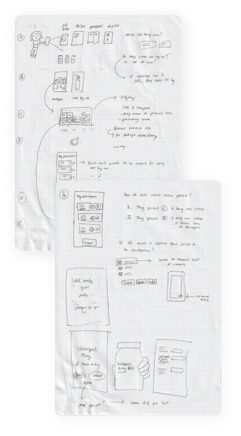
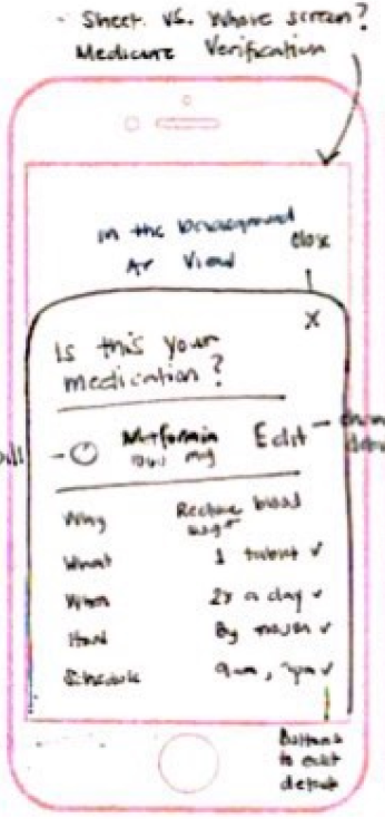
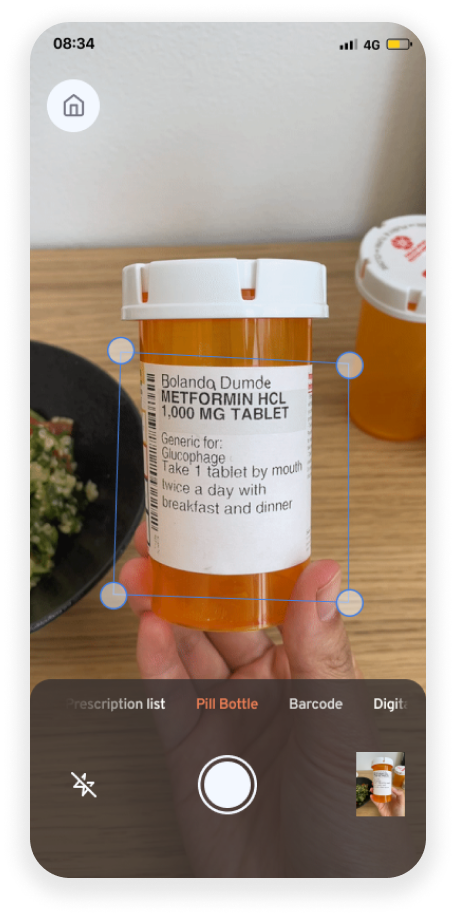
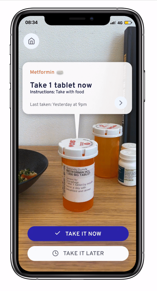
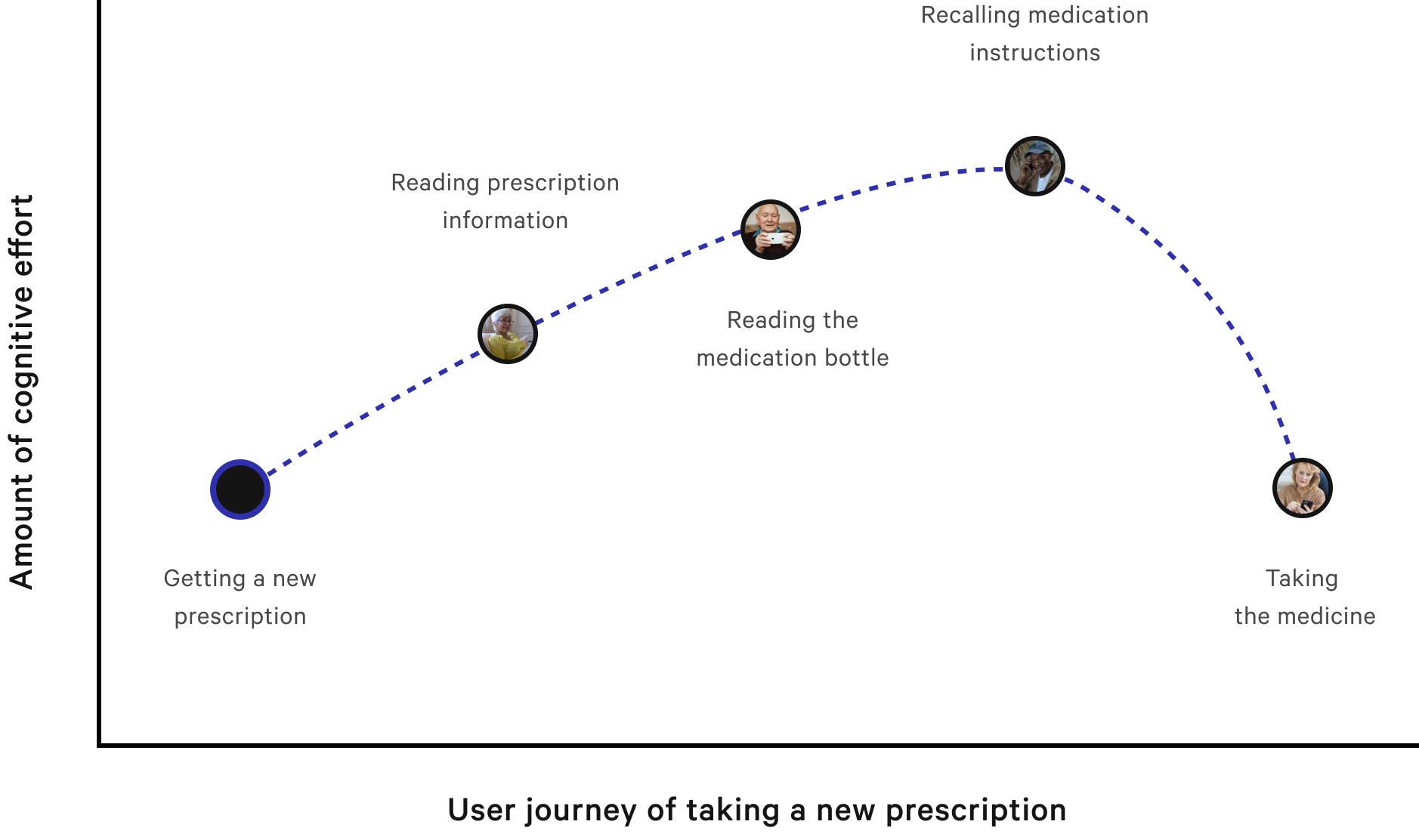
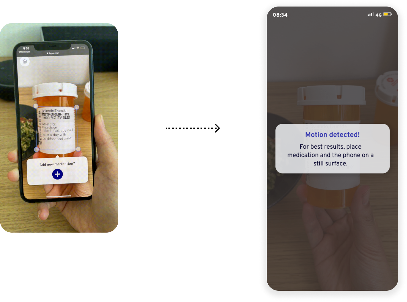
Since scale, movement, and interaction are integral to AR design, I walked through the physical user flow and context to identify potential gaps in the virtual experience.

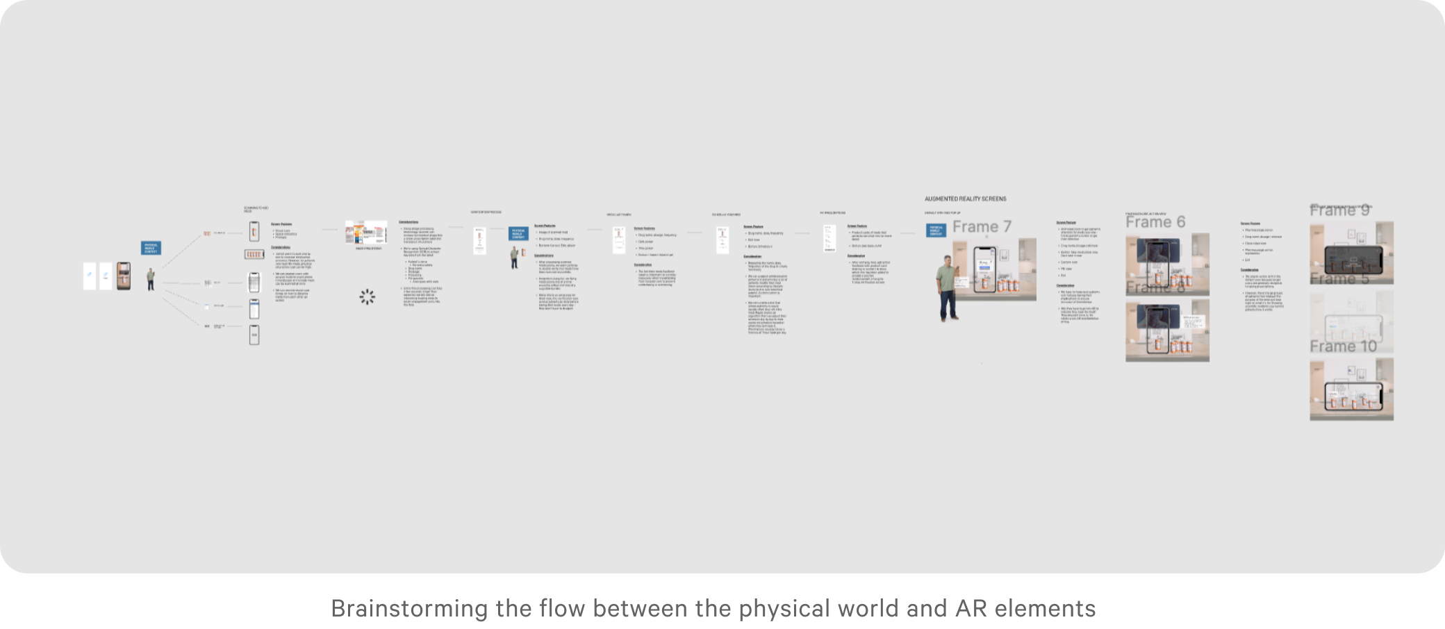
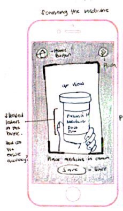
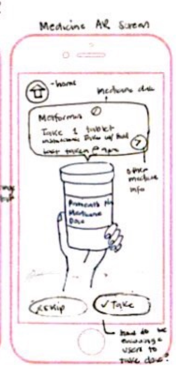
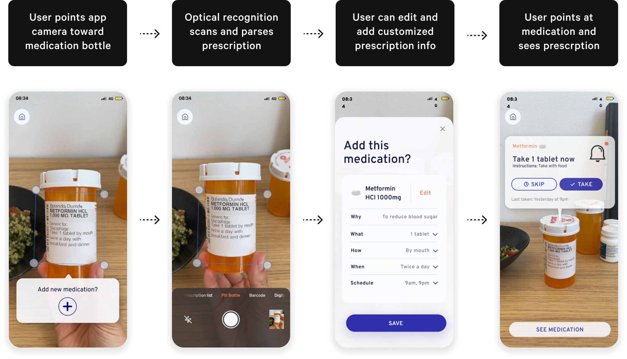
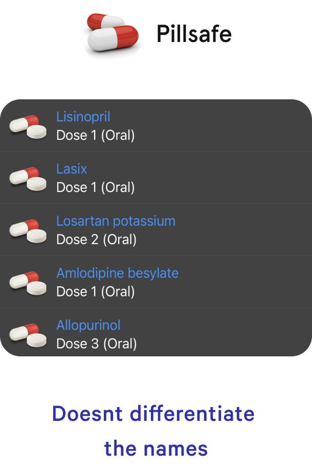
Through this exercise, I realized that if we relied on patients to input prescription data into the app (as they do in current apps), we risk the same human errors leading to fatal medication mistakes.

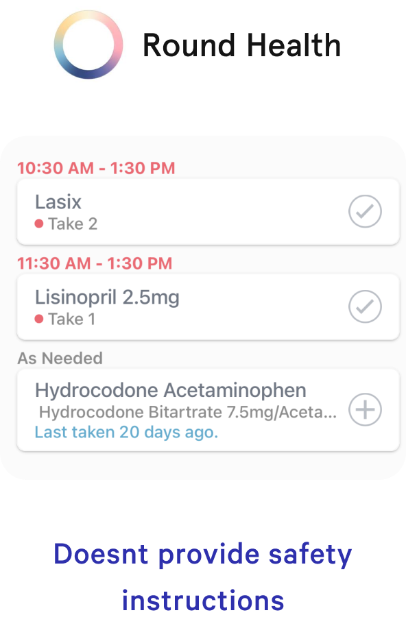
Instead of relying on manual inputs, we can leverage technology like optical character recognition (OCR) to extract and parse prescription data more accurately - Not 100% foolproof but by adding this extra layer of accuracy, we can increase safety. It would also be more efficient than typing long medication names and prescription instructions one at a time.

Organizing my thoughts on the flow before communicating designs to other designers for collaboration

INITIAL SkETCHES

Flow Considerations

Should the app open camera-first?

Inspired by Snapchat’s camera-first approach, Adelie will prioritize the core behavior of checking medication bottles against prescription data using the camera (AR is one of Adelie’s value propositions). Seeing a prescription list is a necessary use case but not the priority task.

How do we correct skewed labels?

Patients will likely scan their bottles which have skewed labels. Luckily, major pharmacies follow a standardized format for their labels. By checking with engineering, I verified that there are solutions to unskew the cylindrical shape of bottles into a linear format so OCR can process data more accurately.

How do we anticipate potential errors?

Patients are likely to store their bottles together and check them all at once (based on research findings). While OCR should still be able to parse multiple data, we have to anticipate this potential for error and prompt users to check one medication at a time or orient their phone on portrait mode. We can also ask them to verify their medicines.

How can users use the app without AR?

Some users might not have wifi access or glitchy camera views which may deny them access to important prescription data. I created a prescription list screen to allow the same actions even if AR isn’t an option.

High-fidelity Prototypes. High-fidelity Prototypes. High-fidelity Prototypes. High-fidelity Prototypes.

Flow #1

Adding medication using optical recognition

Flow #2

Taking medication using augmented reality

Usability Testing. Usability Testing. Usability Testing. Usability Testing.

USABILITY TEST

Adjusting for an augmented reality prototype

I prototyped my sketches into clickable wireframes on Figma and transferred them to Adobe Aero for 3D effect. However, the quaity of the 3D elements appeared unrealistic and glitchy. Given the project’s short timeframe, I decided to test my Figma prototypes instead and use some video magic for the interactions for this sprint.

I worked around this obstacle by helping users visualize that the screen they’re seeing is a camera reacting to their environment with mixed reality components. Although not a perfect solution, I was able to gain insights about usability improvements.

Working around a tool limitation by helping users visualize using video magic

PRIORITY REVISION #1

Using Fogg’s behavior model to motivate action

Initially, I designed for the “Take medicine” button to hover on the bottom of the AR screen. While it was visibly noticeable, users didn’t intuitvely consider it as part of the flow.

According to Fogg’s interaction principle, patients must have 3 elements to take action: motivation, ability, and trigger. I redesigned to make the CTA within closer proximity to the prescription data so the relationship is more apparent.

PRIORITY REVISION #2

Encouraging users to reach their goals

Usability testing revealed that users had to click their medicines as taken ONE BY ONE so they never felt close to finishing their goal.

In goal gradient principle, users are likely to complete their task if they can see that they’re almost there!

To apply the goal gradient principle, I created a goal tracker with a “Mark all taken” button users can become more motivated to complete their goal and within just one click.

User interface design. User interface. User interface design. User interface.

bRANDING

The future of healthcare

Adelie Health serves as a harbinger of change - A brand that signifies a new age in healthcare where technology serves to inspire health independence for patients at home, bridging the gap between hospital care and self care.

By focusing on the brand vision of inspiring health and independence, I identified key attributes that will guide the product’s atomic elements: Inspiring, healthy, friendly, and futuristic.

DESIGN SYSTEM

Creating a cohesive design library

Based on my brand vision, I created a library of elements and components to achieve higher efficiency, consistency, and scalability when building my product for this iteration.

In retrospect...

REGULATIONS

Navigating a regulated problem space

Healthcare is strictly regulated and it’s crucial to consult with a legal team to consider patient privacy, compliance, and lawful dependencies. While I can make assumptions that terms and conditions can satisfy those requirements, it was important to tread with caution and keep these variables in mind as I designed screens.

LONG TERM VISION

Integrating with voice assistance

Moreso than my previous projects, I considered solutions for physical user disabilities. While it’s challenging to design for every edge case, there’s opportunity in using voice assistance so users don’t have to rely on the task of opening the app. Instead, medication notifications can be read aloud by phone or by Alexa when they are due.

Next Steps 👠

  • Create an AR prototype with 3D elements to test
  • Recruit target population for usability testing to optimize product market fit
  • Consider how we can integrate voice assistance
  • Consult subject matter experts for patient privacy and security issues

I got 99 problems.
Here’s two more!