Photo Start

Redesigning to build donor trust and create opportunities for disadvantaged children

Bite-sized summary

Photo Start’s mission relies on the generosity of donors globally so mobile-first and usability were priorities. I volunteered to redesign their web app to balance form with function and help regain user trust.

Project type

Responsive web app redesign

Project stack

Figma, Notion, Whimsical

My role

Product designer

Timeline

One month

Problem

Creating opportunities for disadvantaged children

  • Photo Start is a nonprofit organization that provides opportunities to children in impoverished communities globally.
  • They use photography as a vehicle to teach life and business skills to children who are at risk of violence from street gangs and terrorist groups.
  • Since 2016, they have provided +20,000 education hours and trained 800+ students all over the world.

Audience

Losing user trust and conversion

  • Photo Start’s site has been crashing and difficult to maintain per the CEO
  • Without an on-staff engineer or product manager, the site would sometimes be unusable and they would lose opportunities for donations
  • Simultaneously, many of Photo Start’s supporters were using their mobile devices yet the website wasn’t optimized for mobile use.

SOLUTION

Increase donor trust and participation through a responsive website redesign

the objectives

  • Create a cohesive pipeline that streamlines donor participation, donations and awareness of what the organization does
  • Redesign the web app (17 pages) to enhance responsive user experience
  • Create responsive prototypes for handoff to engineering by end of volunteer term

the challenges

  • The team consisted of primarily volunteers with limited availabiliy to collaborate
  • There was no project manager to oversee timeline and tasks
  • Managing scope creep
  • One month timeframe with 17 pages to ensure responsivenesss
Redesign. Redesign. Redesign. Redesign. Redesign. Redesign. Redesign. Redesign. Redesign. Redesign.

REDESIGN

Before and after comparison

There’s no denying that Photo Start had an engaging website with artistic animations. However, it risked losing user interest over time as users feel lost navigating and began questioning the credibility of the site.

Stakeholders expressed that their priority moving forward is a mobile-responsive website that is minimalist, manageable, trustworthy, and is streamlined for donations. By delicately balancing form with function, I was able to deliver a product that can help Photo Start ultimately achieve their goals.

Before

After

A goal-directed process. A goal-directed process. A goal-directed process.

Project Breakdown

I know you’re busy. So here’s the nutshell of my process with steps I took to get there - some of which are highlighted in more detail in the case study below:
  • 1. Project scoping

    a. High-level scoping of industry problem

    b. Stakeholder meeting

    c. Project scoping

    d. Project timeline

  • 2. Audit

    a. Design Audit

    b. Usability Audit - Testing

  • 3. Research

    a. Research plan

    b. Market research

    c. Competitive analysis

  • 4. Data synthesis

    a. Research findings

    b. Empathy map

    c. User journey

  • 5. Problem definition

    a. POV statement

    b. HMW questions

  • 6. Ideating and strategy

    a. Aligning business and usergoals

    b. Long term vision

    c. Divergent thinking

    d. Convergent thinking

    e. Accessibility

    f. Feature roadmap

    g. Information architecture

  • 7. Interaction design

    a. Task flow

    b. User flow

    c. Product requirements

    d. Low fidelity sketches

  • 8. Usability testing

    a. Mid fidelity wireframes

    b. Prototyping

    c. Usability testing plan

    d. Usability test with users

    e. Affinity mapping

    f. Prioritization of revisions

    g. Updates from usability

❤️ Why I’m passionate about this project

Some of Photo Start’s students had never seen camera or life outside of the slums. Photo Start offers them the opportunity to learn skills they can later use to gain employment to change the trajectory of their lives and lift their family from poverty.

I was deeply inspired by their objective to teach children “how to fish” and teach them skills to succeed instead of simply giving them exhaustible resources.

Project Kickoff

The company believes in maximizing resources for the benefit of their students so operations are run by mostly volunteers juggling their jobs and time. I recognized that clear communication and transparency of blockers was crucial to complete our project. Since there’s no project managers, I took ownership of creating deadlines and a task board as well.

I interviewed the team during a stakeholder meeting to understand the problem in depth, identify the company’s goals, define my role, project scope, and timeline.

Audit. Audit. Audit. Audit. Audit. Audit. Audit. Audit. Audit. Audit.

Design audit

Balancing form
with function

After learning about the company’s pain points, I conducted a thorough audit of each page to assess the previous site’s strengths, weaknesses and opportunities for improvement. This also helped me become familiar with the priority user tasks that need to be evaluated during the first usability audit.

The previous design had a strong brand identity and creative appeal but certain interactive components risked poor response times and user overwhelm. I collaborated with engineering to understand what’s causing high latency times and to prevent it in our redesign project.

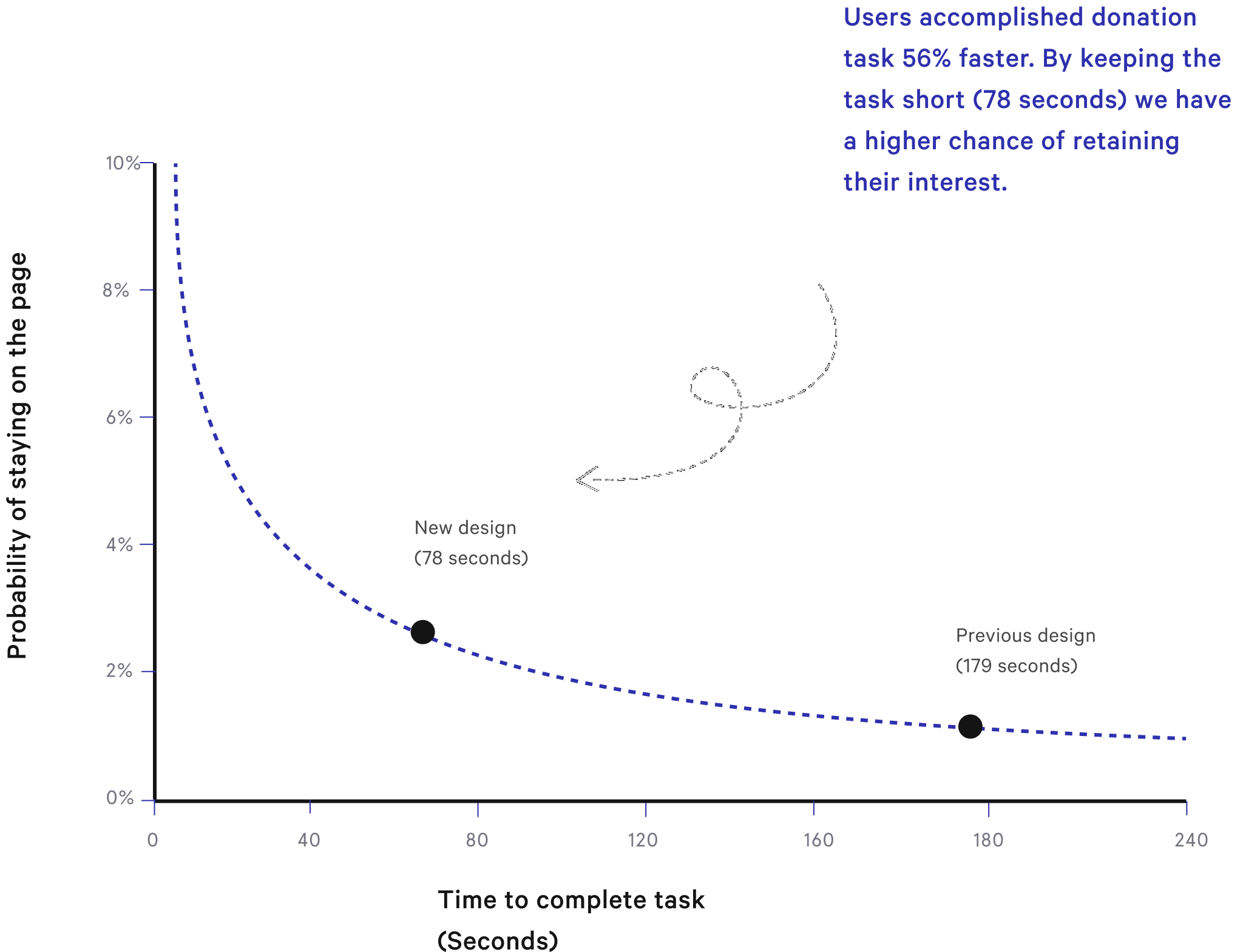
Animated elements increasing latency

Heavy components (the animations) delayed loading speed, disrupted user flow, and risked task abandoment.

Research shows that users can detect a delay over 1000 milliseconds. Loading speed affects SEO ranking which is an important consideration for site discoverability.

9 navigation links overwhelm users

The previous design had 9 navigation links in the top navigation bar which, according to Hick’s Laws, complicates user decision-making by offering more choices.

Content and links can be prioritized to reflect Photo Start’s core goals using progressive disclosure as users become ready to take the next step.

USABILITY audit

Inconsistent branding
causes mistrust

I conducted a usability test and observed users complete three mains tasks: Donate, volunteer, and find out what the organization does.

I discovered a moment during the user journey that caused a shift in user trust. When the user clicks the Donate button, the user is abruptly navigated from Photo Start’s website and taken to a third-party donation platform.

This inconsistent and sudden shift from Photo Start’s familiar branding and into an unknown wesbite caused users to question the credibility of the organization and lose their trust. During usability testing, a user asked me, “Is this a scam?”

Research. Research. Research. Research. Research. Research. Research. Research. Research. Research.

MARKET RESEARCH

Learning about the
donor landscape

One of the project’s earliest obstacles was that the staff had limited access to donor data. While this was a crucial piece of the puzzle, I navigated around this limitation but digging into market research and learning about the current donor landscape.

COMPETITIVE ANALYSIS

Anticipating
mental models

People who donate routinely have established mental models when navigating a nonprofit website. I observed direct and indirect competitors to conduct a stregths, weakness, and opportunity analysis. Below are some of the organizations I studied:

USER JOURNEY

An element that stands
out becomes memorable

The core task of donating money is prolonged through an extensive user journey, requiring multiple clicks and scrolls ultimately leading to an external site since Photo Start was using a third-party donation platform that didn’t match their branding. In isolation effect, an element that stands out becomes memorable to the user. In this case, this causes user mistrust.

Data Synthesis. Data Synthesis. Data Synthesis. Data Synthesis.

EMPATHY MAPPING

What to do with all this information?

Ok so we gathered data from different angles but what does it allll mean? I created an empathy map to discover recurring patterns that potentially highlight unmet user needs. Below are the highlights:

💡 Highlights of pain points

  • The donation process took more steps than expected
  • Users felt lost navigating the site
  • Users felt hesitant to provide credit card information
  • Users were unsure what the organization does
Problem Definition. Problem Definition. Problem Definition. Problem Definition. Problem Definition.

PROBLEM DEFINITION

Turning insights into design questions

After analyzing data, I converted them into point-of-view statements to reframe them within the context of user’s lives. Finally, I reframed those statements into design or how-might-we questions to facilitate the next step: Brainstorming!

Ideating. Strategy. Ideating. Strategy. Ideating. Strategy. Ideating. Strategy. Ideating.

BRAINSTORMING

Divergent vs Convergent

One of my favorite parts is divergent brainstorming or thinking of solutions without constraints. I follow it with a convergent thinking exercise to scope it down to the company’s overarching goals. Below are some of the solutions that might help regain user trust during our redesign.

PRODUCT STRATEGY

If everything is a priority, there’s no priority

When I brainstormed, I considered the core user tasks needed for the second usability test. Now that the foundation is set for this sprint, I prioritized selected features on a roadmap to keep myself aligned with the project scope and deadlines.

INFORMATION ARCHITECTURE

Integrating new content

Users expressed feeling lost while navigating the previous site. Simultaneously, new content needed to be organized along a product roadmap. After consulting with stakeholders and reviewing our timeline, I conducted a card sort to gain insight on user mental models and how new content can be integrated into the architecture.

Interaction Design. Interaction Design. Interaction Design. Interaction Design. Interaction Design.

PROTOTYPING

Designing with
donor psychology

Most people make decisions based on emotion rather than logic. By understanding donor heuristics, I can become more mindful of how donors prefer to be approached digitally. However, I also have to be cautious not to cross the line of manipulative design or dark UX patterns.

Product Requirements

How do we design for motivation?

Users take less than 10 seconds to decide whether to stay on a site. So 3 elements must converge at the same time for behavior to occur - motivation, ability, and prompt.

The landing page is filled with motivating elements and prompts for donors, but the ability to take action is found in other pages. So I designed to encourage action by creating an embedded donation form right in the home page.

How can we help users build empathy for the students?

Our empathic response motivates us to help a singular individual instead of statistics of people. Instead of throwing large numbers, we can highlight real stories and student progress. Using this “individual effect”, we can help donors understand the individual lives they are impacting. By keeping the stories honest, we also avoid deceptive UX techniques.

How can we regain user trust?

During initial user interviews, Photo Start’s credibility was put into question. I initiated the process of obtaining a charity rating from third-party evaluation. However, the application process wouldn’t meet the redesign timeline so we had to pivot directions.

Luckily, Photo Start is trusted by well-known brands like Sony, Canon, Fujifilm, etc. I leveraged this strength instead and placed it on the home page where users spend mere seconds processing whether the site is real or a scam.

How can we increase credibility?

Donors want to know how their money will be used. They feel reassured by financial statements and expense breakdowns. I communicated the importance of cost transparency with the CEO and accounting team but due to limitations, their financial statements are not yet live so we had to get creative.

We displayed some of Photo Start’s statistical accomplishments to demonstrate transparency about their impact for this iteration,

User Interface. User Interface. User Interface. User Interface.

DESIGN SYSTEM

Creating a UI kit from a style guide

One of the project objectives is to stay consistent with Photo Start’s branding. Using their style guide, I created desktop, tablet, and mobile UI kits with thorough documentation to ensure consistent components for the team moving forward.

ACCESSIBILITY

Serving a diverse audience

Photo Start had a well established brand identity. However, certain foreground and background choices wouldn’t pass accessible constrast ratios but I reassured the team that we didn’t have to compromise readability to maintain a strong brand presence. It was important to communicate that brand identity goes beyond colors and carries through with the essence of our text, layout, tone, among others.

Usability Testing. Usability Testing. Usability Testing. Usability Testing.

USABILITY TESTING

Why are we measuring task completion and efficiency?

Research found that 99% of web pages have a negative aging effect - the time users spend on a web page follows a Weibull distribution (see chart below) which prove that the first 10 seconds on a page is critical in keeping users engaged. We needed to cut our tasks shorter and capture user interest in a short time to resolve task abandonment.

I conducted a moderated usability tests but also measured for efficiency - In the previous design, it took 179 seconds to donate. In the new design, the average time was 78 seconds which increased the probability that users would complete donation tasks.

Final Solution

The high-fidelity prototype follows the user in their donation journey in the new redesigned website
See prototype on Figma

In retrospect...

ROLES

Taking the initiative

The fluidity of a volunteer team (coming and going) posed some challenges and inconsistencies but it taught me the value of proper documentation and taking the initiative for unfilled roles, as well as project ownership.

In various stages, I took ownership of UX writing and project management as we filled those gaps. I realized the true value of collaborating with cross-functional specialties to navigate unknowns.

SCOPE CREEP

Scoping it down

I was grateful to contribute to a fulfilling mission and I was excited for the organization’s rebirth! Naturally, the team was compelled to add new content so the scope of the project increased over time.

It was of utmost importance for me to reprioritize and reel it back to the MVP features and pages that would help the organization reach their specified metrics during my time with the team.

I got 99 problems.
Here’s two more!