Twitter Communities

Creating opportunities for group interactions within Twitter’s new group feature

Bite-sized summary

What started out as a concept project adding a groups feature on Twitter evolved to explore other solutions that can increase user interactions using digital gifting, group subscriptions, and virtual tokens.

Project type

Adding features on Twitter

Project stack

Figma, Notion, Whimsical

My role

UX designer

Timeline

One month
*All work put forth in this case study is unsolicited and created for educational purposes

Imagine...

Where’s my tribe?
Trolls, bots, side conversations
There’s no dedicated space
for like-minded folks to gather
*Events loosely based on a true story

UNmet need

It’s easy to make a friend on Twitter but...

  • It’s not so easy to build a relationship with a group of people.
  • There’s no dedicated place for groups to engage in topics of interest over time.
  • A GovLab research found that 70% of group interactions are happening online showing this unmet need on Twitter.

WORKAROUND

It’s hard to make a
group of friends

  • The current workaround is group messaging or using a unique hashtag for an event (like Twitter Chat).
  • Groups end up using other platforms that can accomodate branches of related topics among several people.
  • Topics and Lists only alleviate the need to follow an enduring interest on an individual level.

INITIAL SOLUTION

So I thought.. Yeah, Twitter can use a groups feature.

Plot Twist

Twitter is already on it!

Twitter announced that they are currently developing a groups feature called Communities.

My initial reaction was... Abort! (Cries in UX). Then I realized I can enrich the Communities platform by delving deep into Twitter’s business brand vision and attending Twitter’s Analyst Day.

At the end of the project, I critique my design choices against leaked images of Twitter’s Community screens

GROWTH STRATEGY

Objectives and Key Results

On Investor Analyst Day 2021, Twitter announced their plans to double growth velocity with goals to:

  • Double the number of features per employee that directly drive either mDAU or revenue by 2023
  • >315 million mDAU by Q4 of 2023
  • Double total annual revenue to over $7.5 billion in 2023
  • Continue compounding growth at 20% per year

While these are high-level growth strategies, they give insight about the team’s priorities.

  • People that share interests with others provides intrinsic motivation to keep returning to them.
  • That’s why Communities is at unique position to increase user growth and participation.
  • And thus warrants efforts for scalability within the Community feature itself.

BUSINESS VALUE

Groups are positioned for growth

  • Groups is the ideal place for creators to provide direct creator-to-consumer value
  • Groups give users a sense of belonging and intrinsic motivation to engage on a routine basis and can increase participation.
  • The social component enriches the experience of value consumption and can increase active users.

PROJECT SOLUTION

Instead, I will design complementary features within Communities that will enhance group interactions

the objectives

  • Add complementary features to Twitter’s Communities to enrich group interactions
  • Support Twitter’s growth goals by creating new uses cases for conversations by using audience-funded models
  • Integrate seamlessly within Twitter’s current design patterns and system

the challenges

  • Communities feature has not yet been released so I’m designing concurrently as feature is being built
  • I must not interrupt core user flows on Twitter
  • I must follow Twitter’s design patterns even without access to design system
  • One month timeframe
Introducing. Introducing. Introducing. Introducing. Introducing. Introducing.

Community Experiences

Experience #1

Group subscriptions

Group subscriptions provide a direct creator-to-consumer value in a group setting which enriches value consumption.

Subscriptions allow users to learn directly from subject matter experts. Even more, there’s an added benefit of having sense of belonging in a group and learning with others who share the same interest.

See Subscriptions on Figma

Experience #2

Contributor awards

Girl Scouts knew the value of merit badges. Awards can seed discussion and incentivize quality contribution. Contributor awards can promote content creation from any participant -- not just from moderators or the 1% active content creators in social media.

Awards can also gamify an experience or provide users an easy, alternate way to interact with others.

See Awards on Figma

Experience #3

Virtual currency

Social tokens can gamify social interactions while allowing in-app transactions within Twitter’s ecosystem.

Twitter Coins can eventually be cashed out, donated or and potentially used for ad transactions in Twitter - opening up doors to more ways users can engage with others.

See Currency on Figma

A goal-directed process. A goal-directed process. A goal-directed process.

Project Breakdown

I know you’re busy. So here’s the nutshell of my process with steps I took to get there - some of which are highlighted in more detail in the case study below:
  • 1. Project scoping

    a. High-level scoping of industry problem

    b. Project scoping

    c. Project timeline

    d. Brand Strategy

  • 2. Research

    a. Research plan

    b. Market research

    c. Competitive analysis

    d. User interview guide

    e. User interview

    f. Survey

    g. Literature review

  • 3. Data synthesis

    a. Research findings

    b. Empathy map

    c. User persona

  • 4. Problem definition

    a. POV statement

    b. HMW questions

  • 5. Ideating and strategy

    a. Aligning business and usergoals

    b. Long term vision

    c. Divergent thinking

    d. Convergent thinking

    e. Accessibility

    f. Feature roadmap

    g. Information architecture

  • 6. Interaction design

    a. Task flow

    b. User flow

    c. Product requirements

    d. Low fidelity sketches

    e. Mid fidelity sketches

  • 7. Usability testing

    a. High fidelity wireframes

    b. Prototyping

    c. Usability testing plan

    d. Usability test with users

    e. Affinity mapping

    f. Prioritization of revisions

    g. Updates from usability

  • 8. User interface design

    a. Design system

    b. High fidelity prototype

❤️ Why I’m passionate about this project

Admittedly, I was a late adopter of Twitter. But it didn’t take long for me to fall in love with the active community of designers and stock HODLers. But as much as I enjoyed keeping up with witty pro-Twitter users, I felt like a spectator more than a participant.

Whenever I posted a tweet, it was lost to the feed abyss unheard and unseen - I knew there had to be a way to achieve a sense of belonging on Twitter...

Research

The initial challenge for this project scope was to add a feature for an existing product that had an unmet user need. Because I was a Twitter user myself, I had to resist being solution-focused so I can validate unknowns and assumptions first.

To avoid skipping a step, I began by defining project goals, constraints, scope, and timeline. Then I created a research plan and kicked off a goal-directed process by reviewing Twitter’s brand vision and keeping it user-centric by learning in depth about Twitter users.

MARKET RESEARCH

Understanding the context

My framework follows a user-centered approach so the first step is to understand Twitter’s userbase, their needs, how they use the platform, and the life context within which they use it.

USER INTERVIEW

Digging into the why and how

I created a participant criteria based on market research insights and recruited 5 Twitter users who use other social platforms so there’s a reference point for comparison. I wanted to learn about their goals, needs, pain points, and why they use Twitter over other platforms and vice versa.

BACK TO QUANTITATIVE RESEARCH

Validating hypothesis and assumptions

Most of the interview participants have supported content one way or another whether it’s sending a cup of coffee, paying for a subscription, sending a one-time support or a gift. Since Twitter was taking an interest in audience-funded models (AFM), this was an insight worth exploring further to align user needs with business goals.

Before we get excited, I needed to validate that users are in fact supporting other users. Given my ticking timeframe, I conducted a survey to gain quantitative understanding.

lITERATURE REIVEW

The loudest wheel gets the grease?

There’s one more thing I need to check. Let’s see some deep user frustrations enough to warrant a review on the App store.

I know I’m going to take these with a grain of salt (some reviews are wild and extreme) but I need to see if any pain points are prevalent enough to explore further. If anything, we can have fun reading some very passionate reviews.

Data Synthesis. Data Synthesis. Data Synthesis. Data Synthesis.

EMPATHY MAPPING

What to do with all this information??

Ok so we gathered data from different angles but what does it allll mean? I created an empathy map to discover recurring patterns that potentially highlight unmet user needs.

💡 Some research highlights

  • Users are not finding topics of interest easily
  • Most users are quiet consumers
  • Users feel bombarded by promoted content

User Persona

Who are we creating for?

I created Dwight, a user archetype, to represent my research insights. Although a persona cannot replace usability testing, I can measure my design choices tentatively against my persona.

Problem Definition. Problem Definition. Problem Definition. Problem Definition.

DESIGN QUESTION

Turning research into design questions

I reconstructed user needs into How Might We questions that frame the problems from the user’s perspective and life context.

Ideating. Strategy. Ideating. Strategy. Ideating. Strategy. Ideating. Strategy.

BRAINSTORMING

Divergent vs convergent

One of my favorite parts - divergent brainstorming to think of solutions without limitation followed by a convergent thinking exercise to scope it down.

I also ask opposite questions for warm up like - How might we stop Dwight from engaging in Communities?

Product Strategy

Aligning brand vision and user needs

I narrow down solutions by aligning with business goals, technical feasability, and constraints. Sometimes, business and user goals can appear conflicting. While Twitter wants to double ad revenue, users want to eliminate ads - this requires some outside-of-the box solutions to make ends meet.

Why audience-funded model (AFM) solutions?

  • AFMs come in many forms from subscriptions, tipping, gifting, crowdfunding. Some compare it to digital tipping where users can directly fund the content they value most.
  • AFM aligns the interests of creators and users. Users inherently become more interested and engaged with each other, building a stronger community native within the platform.
  • During the pandemic, self-monetization also became more accepted and gained traction in social media. More people are comfortable supporting digital craft which incentivizes quality content.

How do users perceive audience-funded content?

COMPETITIVE ANALYSIS

Finding opportunities in the current market

Since Twitter Communities is not yet released, I checked my knowledge gaps and assumptions by studying online groups and existing audience-funded models (AFM) from Youtube to Facebook to Buy Me Coffee to OnlyFans. I discovered that various AFMs are gaining acceptance and traction in social media.

See full comp analysis on Notion

FEATURE ROADMAP

If everything is a priority, there’s no priority

When I brainstormed, I considered the core user stories, tasks, and accessibility. Now that the foundation is set for this sprint, I prioritized selected features on a roadmap to keep myself aligned with the project scope and timeline.

INFORMATION ARCHITECTURE

Being mindful of Twitter’s red routes

One of my project challenges is to preserve core flows or risk disorienting loyal Twitter users. I added Communities in the home screen’s hamburger slideout menu since it’s the main navigation touch point on mobile, but I considered native notifications and in-app toasts as possible entry points as well.

Interaction Design. Interaction Design. Interaction Design. Interaction Design.

USER FLOWS

Strategizing user flow in structure

A task flow is linear and shows a happy path but it doesn’t consider other uses cases. I created a user flow to assess how decison points might send a user down a different path.

USE CASEs

Integrating within an existing product

Working within an established platform like Twitter, I have to consider possible development resources and leverage components without causing users to feel lost if screens look too similar.

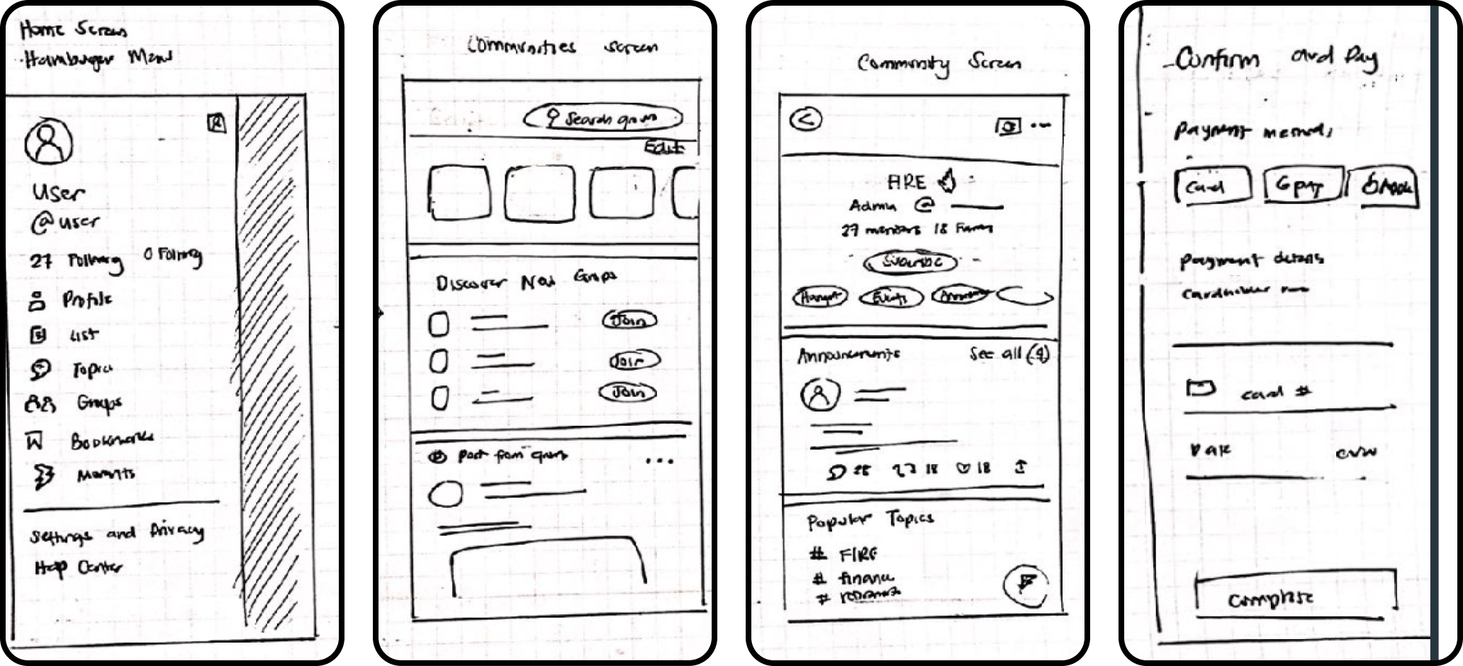
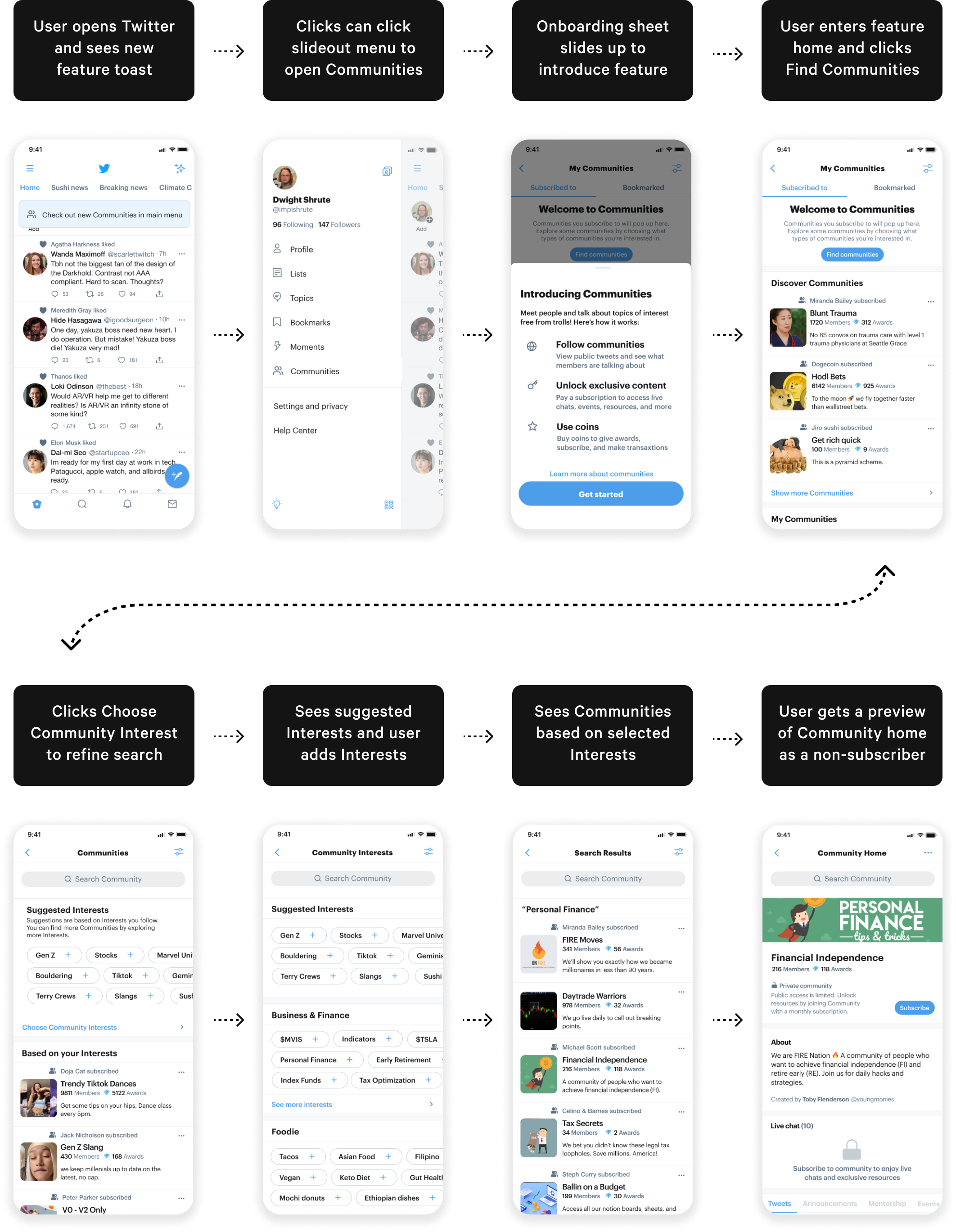
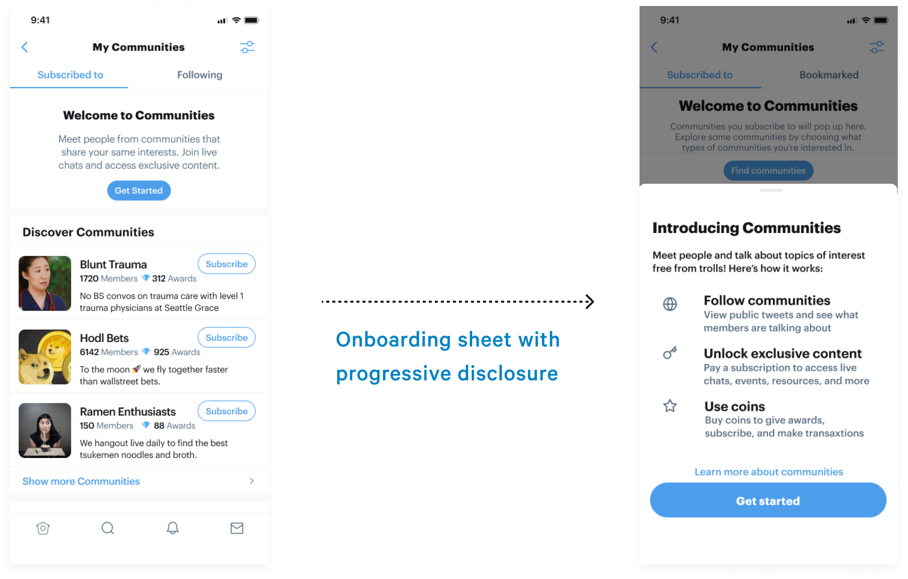
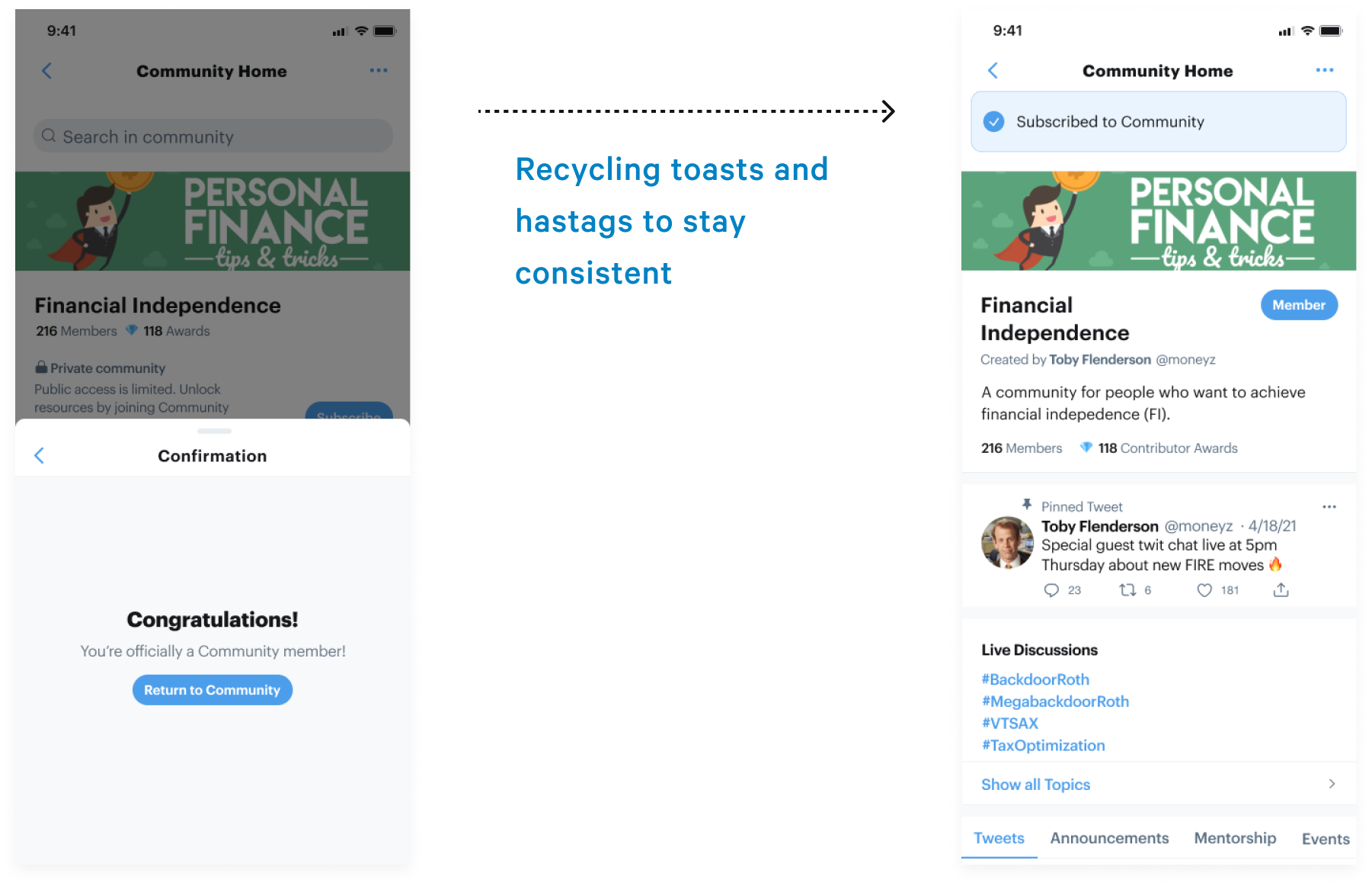
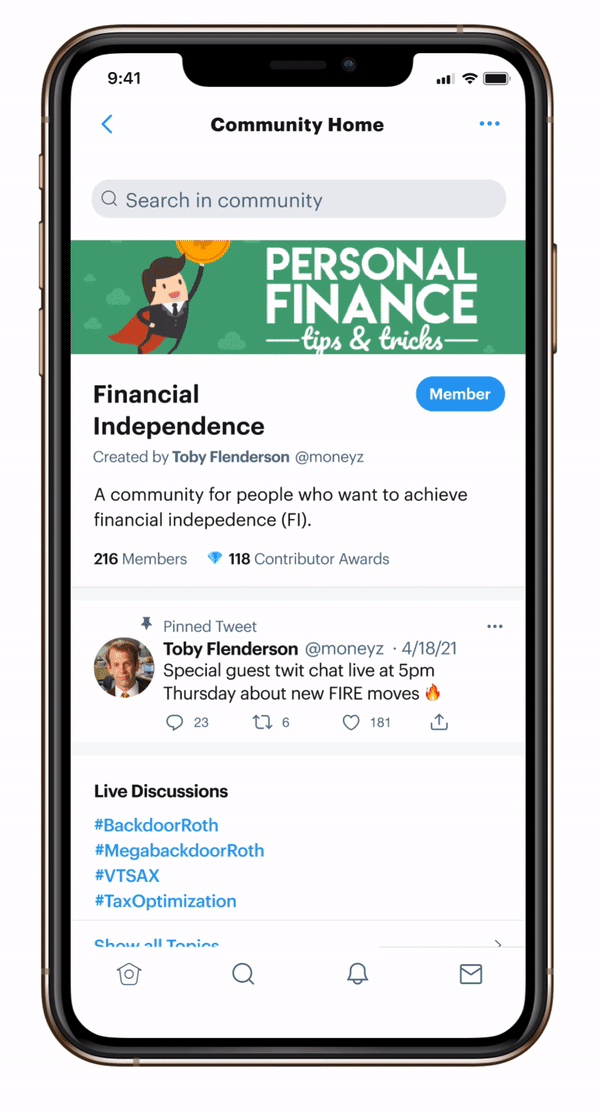
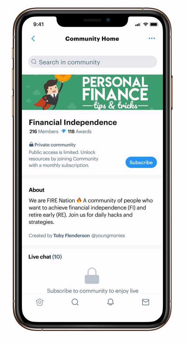
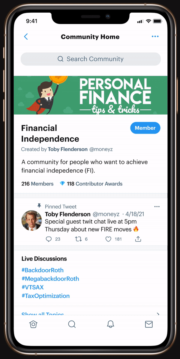
How can we assist discoverability for novice versus proficient users?

Rolling out a new feature, we have to consider both novice and proficient users. To onboard new users, the “Welcome to Communities” header provides helper text followed by suggestions. To assist proficient users, filter/sort controls and a search bar (in next screen) help them discover groups.

How can we recycle design patterns?

I need to consider development resources but if screens look too similar, users might feel disoriented. To achieve a balance, I recreated product cards inspired from Lists/Topics that are similar enough to reproduce from the component’s library but different enough to recognize by users.

How can we provide task accelerators for this specific use case?

Profile product cards and List product cards have “Follow” buttons. I initially designed Community cards with a “Subscribe” button but realized that in this use case, users typically need more data before joining - Instead I added elements that can help users make the decision to coin. According to market research, users look at member count, value proposition, and social proof like - Has my friend joined?

How to maximize use of empty spaces?

Twitter already uses empty states as learning moments that cue beginners into next steps with actionable links. By following this pattern, we avoid extra clicks into “tutorial” screens and allows for easy scanning of information.

User Interface. User Interface. User Interface. User Interface. User Interface.

Design System

Following Twitter’s design systems

One of the project challenges is to design with Twitter’s existing patterns without access to their components library. So I did what every sane designer would do... screenshot Twitter screens, resize for device, and manually copy elements so I can follow patterns. Below are some of the components I used for this project.

ACCESSIBILITY

Improving touch points

Some of the ways I considered accessibility is to improve target sizes, reducing columns and increasing sheet height for ease of use specifically for the Awards screen which had crowding targets.

High-fidelity prototypes. High-fidelity prototypes. High-fidelity prototypes. High-fidelity prototypes. High-fidelity prototypes.

Flow #1

Discovering communities

Flow #2

Subscribing to private communities

Flow #3

Sending an award to another user

Usability Testing. Usability Testing. Usability Testing. Usability Testing. Usability Testing. Usability Testing.

Usability Test

Seeing reactions to new features

The goal was to place designs in the hands of users as early as possible and figure out if my solutions are usable in the context of user needs. Also, I wanted to see the reaction of Twitter users to a new groups feature. I observed 5 participants during a “read aloud” moderated usability test and grouped similar observations to extract patterns.

PRIORITY REVISION #1

What are Communities and why do we have to pay for them?

For a first-time user clicking into the Communities home screen, users felt the feature wasn’t defined well enough. I created an onboarding sheet to provide an overview. Using progressive disclosure, I added a “Learn More” button so they can understand the value of the feature.

PRIORITY REVISION #2

Users didn’t understand the value of giving digital coins

So there’s a consistent pattern of users needing more information... Good insight! I added more guiding text to help users understand the currency system. I also added a coin balance section for efficient users and subscription lengths to help define their value.

PRIORITY REVISION #3

Adjusting elements to be consistent with Twitter’s patterns

I initially designed a celebratory gif when users sent a gift to another user - a gamified effect consistent with other platforms. However, it wasn’t consistent with Twitter’s system. I redesigned a toast feedback instead. I also recycled hashtags for subgroup discovery within Communities just as users would discover topics.

Final Solution

The protoype takes users on three different experiences that can enhance group connections through audience-supported models
See prototype on Figma
Leaked Screens. Leaked Screens. Leaked Screens. Leaked Screens.

We designed for a public view with limited access

Happy to report that both Twitter and my designs ensured everyone can still benefit from the Community without joining - which goes back to Twitter’s mission for public and accessible conversations. A group subscriptions can however allow for more participation and up-to-date information.

Prioritized social proof at the top of the screen

Both designs show how many members have joined and who the creator was. In my designs, I added the contributor awards to show that others have been provided value.

In retrospect...

Takeaway

Integrating into an existing system

While it’s nerve-wrecking to design for a space that’s yet to be released, I learned to operate under limited data and to be resourceful in finding answers. I learned about the importance of recycling design patterns and seamless integration so the user has to learn as little as possible while gaining benefits from the new features.

LONG TERM VISION

Considering localization

In the future, I would love to work on design localization considering that Twitter has a large user base in Japan, India, and UK. It’s important to consider how features might be designed in the context of cultural mental models especially when gifting and currencies are involved.

Next Steps 👠

  • Create split testing for new features
  • Slow release to smaller markets
  • Understanding gifting and currencies in other cultures
  • Consult with Twitter designers to consider consistency with patterns

I got 99 problems.
Here’s two more!